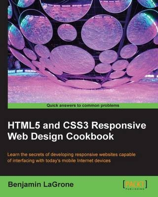
HTML5 and CSS3 Responsive Web Design Cookbook
Packt Publishing Limited (Verlag)
978-1-84969-544-2 (ISBN)
- Titel ist leider vergriffen;
keine Neuauflage - Artikel merken
Benjamin LaGrone is a web developer who lives and works in Texas. He got his start in programming at the age of 6 when he took his first computer class at The Houston Museum of Natural Science. His first program was a “Choose your own adventure” book written in BASIC, and he has fond memories of the days when software needed you to write line numbers.Fast forward about thirty years, and after deciding that these computers are here to stay, Ben has made a career combining some of his favorite things — art and coding; creating art from code. One of his favorite projects was using the GMaps API to map pathologies to chromosomes for cancer research.Fascinated for a long time with mobile devices, Ben thinks that the responsive web is one of the most exciting, yet long awaited, new aspects of web development. He now works in a SAAS development shop and is the mobile and responsive web evangelist for the team.When he's not working on some Internet project, Ben spends some time building robots, tinkering with machines, drinking coffee, surfing, and teaching Kuk Sool martial arts.This book could not have been written without the patience and support of my loving wife, Hannah, and my two beautiful daughters, Daphne and Darby. Thank you.
Preface Chapter 1: Responsive Elements and Media Chapter 2: Responsive Typography Chapter 3: Responsive Layout Chapter 4: Using Responsive Frameworks Chapter 5: Making Mobile-first Web Applications Chapter 6: Optimizing Responsive Content Chapter 7: Unobtrusive JavaScript Chapter 1: Responsive Elements and Media Introduction Resizing an image using percent width Responsive images using the cookie and JavaScript Making your video respond to your screen width Resizing an image using media queries Changing your navigation with media queries Making a responsive padding based on size Making a CSS3 button glow for a loading element Chapter 2: Responsive Typography Introduction Creating fluid, responsive typography Making a text shadow with canvas Making an inner and outer shadow with canvas Rotating your text with canvas Rotating your text with CSS3 Making 3D text with CSS3 Adding texture to your text with text masking Styling alternating rows with the nth positional pseudo class Adding characters before and after pseudo elements Making a button with a relative font size Adding a shadow to your font Curving a corner with border radius Chapter 3: Responsive Layout Introduction Responsive layout with the min-width and max-width properties Controlling your layout with relative padding Adding a media query to your CSS Creating a responsive width layout with media queries Changing image sizes with media queries Hiding an element with media queries Making a smoothly transitioning responsive layout Chapter 4: Using Responsive Frameworks Introduction Using the Fluid 960 grid layout Using the Blueprint grid layout Fluid layout using the rule of thirds Trying Gumby, a responsive 960 grid The Bootstrap framework makes responsive layouts easy Chapter 5: Making Mobile-first Web Applications Introduction Using the Safari Developer Tools' User Agent switcher Masking your user agent in Chrome with a plugin Using browser resizing plugins Learning the viewport and its options Adding tags for jQuery Mobile Adding a second page in jQuery Mobile Making a list element in jQuery Mobile Adding a mobile, native-looking button with jQuery Mobile Adding a mobile stylesheet for mobile browsers only using media queries Adding JavaScript for mobile browsers on Chapter 6: Optimizing Responsive Content Introduction Responsive testing using IE's Developer Tools Browser testing using plugins Development environments getting a free IDE Virtualization downloading VirtualBox Getting a browser resizer for Chrome Chapter 7: Unobtrusive JavaScript Introduction Writing "Hello World" unobtrusively Creating a glowing "submit" button with the event listener Making a button stand out when you hover over it Resizing an element with unobtrusive jQuery Masking a password with unobtrusive JavaScript Using an event listener to animate an image shadow
| Erscheint lt. Verlag | 23.5.2013 |
|---|---|
| Verlagsort | Birmingham |
| Sprache | englisch |
| Maße | 191 x 235 mm |
| Themenwelt | Informatik ► Web / Internet ► Web Design / Usability |
| ISBN-10 | 1-84969-544-X / 184969544X |
| ISBN-13 | 978-1-84969-544-2 / 9781849695442 |
| Zustand | Neuware |
| Informationen gemäß Produktsicherheitsverordnung (GPSR) | |
| Haben Sie eine Frage zum Produkt? |
aus dem Bereich


