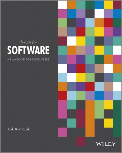
Design for Software
John Wiley & Sons Inc (Verlag)
978-1-119-94290-0 (ISBN)
- Titel z.Zt. nicht lieferbar
- Versandkostenfrei
- Auch auf Rechnung
- Artikel merken
A unique resource to help software developers create a desirable user experience
Today, top-flight software must feature a desirable user experience. This one-of-a-kind book creates a design process specifically for software, making it easy for developers who lack design background to create that compelling user experience. Appealing to both tech-savvy designers and creative-minded technologists, it establishes a hybrid discipline that will produce first-rate software. Illustrated in full color, it shows how to plan and visualize the design to create software that works on every level.
Today's software demands attention to the quality of the user experience; this book guides you through a practical design process to achieve that goal
Approaches the mechanics of design with a process inspired by art and science
Avoids the abstract and moves step by step through techniques you can put to use immediately
Covers planning your design, tested methods, how to visualize like a designer, psychology of design, and how to create software that developers will appreciate
Explores such elements as choosing the right typeface and managing interactivity
Design for Software: A Playbook for Developers brings the art of good design together with the science of software development to create programs with pizazz.
Erik Klimczak is a Creative Director in Chicago dedicated to making technology meaningful for his clients. He has assisted in the design and production of software for industries as diverse as healthcare, automobiles, finance, retail, law, entertainment, insurance, marketing, education, consumer products, gaming, sports, food and beverage, communications, media, security and more. As a hybrid technologist/artist, Klimczak is uniquely positioned to present design theory concepts to tech-minded professionals who don’t have a background in traditional design.
Acknowledgements viii Introduction 1
Part I: Research 5
CHAPTER 1 Planning 7
An Introduction to User Research 8
User Research Is Not Usability 9
Design Lingo: Ethnography 9
Start with User Insights 9
Case Study: Lightning Fast Checkout 14
Making Sense of Your Findings 18
Summary 20
CHAPTER 2 Inspiration 21
Steal Like an Artist 22
If All Else Fails 34
Summary 36
Part II: Design Thinking 37
CHAPTER 3 Sketching 39
Design Thinking—A Developer’s Kind of Design 40
Sketching—Where It All Begins 40
The Benefi ts of Sketching 41
When to Sketch 42
Tools for Sketching 42
The Basics of Application Flows 47
Creating an Application Flow 49
What Storyboards Can Do for You 58
When to Use Storyboards 59
Creating a Storyboard 59
Not Sure Where to Begin? Start with a Template 60
Summary 62
CHAPTER 4 Information Architecture 63
What Is information Architecture, Exactly? 65
The Cost of Usability 65
Information Architecture Deliverables 66
Personas, User Scenarios, and Storyboards 67
Content Models 67
Application Flow 67
Wireframes 69
Gesture Dictionary 69
Information Architecture Is All About the Content 70
Make It Meaningful 70
Information Architecture: Like a Boss in Five Steps 72
Step 1: Define Themes, Goals and Requirements 73
Step 2: Choose a Layout 74
Step 3: Group Similar Items 85
Step 4: Be Consistent 86
Step 5: Reduce 87
Summary 88
CHAPTER 5 Wireframes 91
Debunking Wireframes 92
Wireframes 101 93
When Should You Create the Wireframes? 93
Anatomy of a Wireframe 94
Are You Speaking Wireframe? 95
Do’s & Don’ts 98
Tools for Awesome Wireframes 102
Tools for Awesome-er Wireframes 105
Wireframe Techniques 107
Wireframe Technique #1: Creating the Basic Wireframe 107
Wireframe Technique #2: Using Shades of Gray and One Color 108
Wireframe Technique #4: Using the Frame-by-Frame Approach 111
Wireframe Technique #5: Using Bubbles 112
Wireframe Technique #6: Magnifying Details 112
Summary 114
CHAPTER 6 Prototyping 115
When Should I Prototype? 116
1. Communicating a New Idea 117
2. Creating a Proof of Concept 117
3. Conducting Basic Usability Testing 117
4. Determining Whether an Idea Is Worth a Bigger Investment 117
What Makes an Eff ective Prototype? 118
Fake It—Be Clever, Not Complicated 120
Making “Little Bets” 121
Awesome Tools for Prototyping 122
Microsoft SketchFlow 122
Adobe Edge Tools 123
Adobe After Effects 124
Keynote / PowerPoint 125
HTML / JavaScript / CSS3 126
Axure RP 127
Arduino, Openframeworks, Processing 128
Prototyping Techniques 129
Prototyping Technique #1: Paper Prototypes 130
Prototyping Technique #2: Interactive Wireframes 131
Prototyping Technique #3: Video Prototyping 136
Summary 140
Part III: Visual Design 141
CHAPTER 7 Color 143
Color Basics 144
Color Vocabulary 144
Color Models 146
Cool and Warm Colors 149
The Psychology of Color 151
Contrast 154
Applied Color: A Few Rules of Thumb 156
Stick With Two to Three Colors 156
Start with Solids, Then Move to Gradients 157
Use Shades of a Hue 157
Green Means Go 157
What Makes a Good Color Palette? 158
Shades of Gray 159
Five Color Palettes You Can’t Go Wrong With 160
Color Techniques 163
Color Technique #1: Use a Photograph to Generate a Color Palette 163
Color Technique #2: Code with Color 165
Color Technique #3: Use Photoshop 167
Bonus Color Technique: Use an Algorithm to Find Average Color 170
Summary 173
CHAPTER 8 Digital Typography 175
First Things First 176
A Lap Around Typography 177
Understanding Type Terminology 177
Font or Typeface—What’s the Difference? 182
Type Classification 182
Serif Typefaces 182
Sans-Serif Typefaces 185
Eight Ways to Improve Your Typography 187
1. Pick a Scale and Stick with It 187
2. Use Consistent Spacing 188
3. Consider the Measure 189
4. A Little Can Go a Long Way 190
5. Pick a Good Body Font 191
6. Use a Single Family 193
7. Combine Two to Three Typefaces 194
8. Use a Good Ampersand 199
Summary 199
CHAPTER 9 Visual Communication 201
It Ain’t Th at Simple 202
1. Design As Th ough You’re Designing for Yourself 203
2. Be Consistent 203
Five Ways to Clarify Your Design 204
1. Slap a Grid on It 204
2. Establish Hierarchy 211
3. Remove the Junk 215
4. Check for Parallelism 220
5. Create Clear Aff ordances 221
Summary 226
CHAPTER 10 Motion 227
Animations Look Cool, but Can Th ey Actually Make It Work Better? 228
Transitions, Animations, and Timing Guidelines 229
What’s the Difference Between an Animation and a Transition? 229
Not Too Fast, Not Too Slow, Not Too Many 230
When Should I Use Motion? 230
When Should I Avoid Motion? 231
Fade, Slide, and Scale—Animation’s Super Tools 232
Fade 232
Slide 233
Scale 233
Motion Principles 234
Slow In and Slow Out 234
Squash and Stretch 235
Anticipation 236
Follow-Through and Overlapping Action 237
Arcs 238
Easing 239
Advanced Motion Techniques 242
Follow 242
Cognitive Tomfoolery 243
Summary 244
Part IV: Interaction Design 245
CHAPTER 11 Interaction Design Principles 247
An Introduction to Interaction Design 248
Getting In the Flow 249
Ways to Facilitate Flow 250
Learnability Versus Usability 256
Designing for Usability 256
Designing for Learnability 258
Ergonomics 259
Muscle Fatigue 260
Field of View and Peripheral Vision 261
Environment and Lighting Conditions 263
Optimal Touch Targets 263
Occlusion 265
Summary 267
CHAPTER 12 Design Patterns 269
Why Use Design Patterns? 270
Other Design Pattern Resources 271
The Patterns 273
Auto Focus 274
Drag and Drop 274
Auto Save 275
Blank Slate 276
Progress Indicators 277
Use Good Target Sizes 278
A Button Is a Button Is a Button 279
Avoid Modal States unless It’s Critical to Use Them 279
Direct Manipulation 281
Group Like Items 281
Continuous Scrolling 282
Size to Importance Visualization 283
Glance-View Dashboard 284
Error-Proof Controls 285
Get Me Out of Here 286
Right/Left Input Alignment 287
Super Search 288
Simple Task, Simple UI; Complex Task, Complex UI 288
Sync Position 290
Contrast Your Fonts 290
Summary 291
Index 293
| Erscheint lt. Verlag | 3.5.2013 |
|---|---|
| Verlagsort | New York |
| Sprache | englisch |
| Maße | 188 x 234 mm |
| Gewicht | 721 g |
| Themenwelt | Informatik ► Office Programme ► Outlook |
| ISBN-10 | 1-119-94290-X / 111994290X |
| ISBN-13 | 978-1-119-94290-0 / 9781119942900 |
| Zustand | Neuware |
| Informationen gemäß Produktsicherheitsverordnung (GPSR) | |
| Haben Sie eine Frage zum Produkt? |
aus dem Bereich


