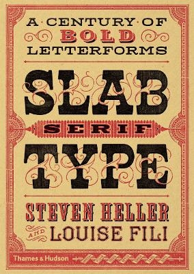
Slab Serif Type
A Century of Bold Letterforms
Seiten
2016
Thames & Hudson Ltd (Verlag)
978-0-500-51849-6 (ISBN)
Thames & Hudson Ltd (Verlag)
978-0-500-51849-6 (ISBN)
- Titel ist leider vergriffen;
keine Neuauflage - Artikel merken
Since being introduced in the 19th century, when they were considered the bastard cousins of more refined serif types, slab serif typefaces have become ubiquitous. Following the cult typography volumes Scripts, Shadow Type and Stencil Type, this volume artfully selects classic examples to present fresh and unexpected typographic ideas.
Since being introduced in the 19th century, when they were considered the bastard cousins of more refined serif types, slab serif typefaces have become ubiquitous. Prized for their bold visual impact and versatility, they are used on a broad variety of demonstrative communications, from posters and newspapers to product packaging. In 1931, Morris Fuller Benton created the Stymie typeface, a reworking of a slab serif type popular in Europe at that time: Memphis. The IBM logo is one of the most famous slab serif marks: it began as Stymie and was refined by Paul Rand. Slabs come in many iterations and are recognized as a face with many characters – and nationalities.
Following the cult typography volumes Scripts , Shadow Type and Stencil Type , this new volume artfully selects classic examples to present fresh and unexpected typographic ideas. The authors employ their decades of combined experience as art directors to present hundreds of wonderful examples in a visual resource that will delight and inspire today’s designers.
Steven Heller is co-chair of the MFA Design: Designer as Author programme at the School of Visual Arts, New York. He is the author of many books, including Stencil Type, Graphic, Typography Sketchbooks, New Ornamental Type and New Vintage Type, all published by Thames & Hudson. Louise Fili is director of Fili Design, a New York–based design studio specializing in vintage typographic treatments.
Introduction • American • Italian • French • Dutch • British • German • Bibliography
| Erscheinungsdatum | 26.08.2016 |
|---|---|
| Zusatzinfo | 50 Illustrations, black and white; 450 Illustrations, color |
| Verlagsort | London |
| Sprache | englisch |
| Maße | 173 x 246 mm |
| Gewicht | 1220 g |
| Themenwelt | Kunst / Musik / Theater ► Design / Innenarchitektur / Mode |
| Informatik ► Grafik / Design ► Desktop Publishing / Typographie | |
| Technik | |
| ISBN-10 | 0-500-51849-1 / 0500518491 |
| ISBN-13 | 978-0-500-51849-6 / 9780500518496 |
| Zustand | Neuware |
| Haben Sie eine Frage zum Produkt? |
Mehr entdecken
aus dem Bereich
aus dem Bereich


