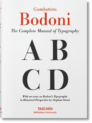
Giambattista Bodoni. The Complete Manual of Typography
Seiten
2016
TASCHEN GmbH (Verlag)
978-3-8365-2036-2 (ISBN)
TASCHEN GmbH (Verlag)
978-3-8365-2036-2 (ISBN)
- Titel ist leider vergriffen;
keine Neuauflage - Artikel merken
This complete reprint of Giambattista Bodoni’s Manuale tipografico revives one of history’s greatest typographical achievements. With 142 sets of roman and italic typefaces, it offers an unrivalled overview of the uniform design, neatness, good taste, and charm, that set the standard for type thereafter, as well as the origins of the still much-used Bodoni typeface.
Official printer for the Duke of Parma, Giambattista Bodoni (1740–1813) declared that well-designed type derived its beauty from four principles: uniformity of design, sharpness and neatness, good taste, and charm. In his Manuale tipografico, published posthumously in 1818, he distilled these principles into a comprehensive catalog of type and set the standard for printing the alphabet thereafter.
TASCHEN’s meticulous reprint of Bodoni’s masterwork celebrates what was an unprecedented degree of technical refinement and visual elegance, as well as exploring the origins of the much-loved Bodoni typeface, still frequently deployed in both print and digital media. Like the original, the book features 142 sets of roman and italic typefaces, a wide selection of borders, ornaments, symbols, and flowers, as well as Greek, Hebrew, Russian, Arabic, Phoenician, Armenian, Coptic, and Tibetan alphabets.
Stephan Füssel is director of the Institute for Book Studies at the Johannes Gutenberg University in Mainz, and holder of the Gutenberg Chair at the same university. He has published prolifically on the early days of printing, the sale and publication of books between the 18th and 20th centuries, and the future of communications.
| Erscheinungsdatum | 24.06.2016 |
|---|---|
| Reihe/Serie | Bibliotheca Universalis |
| Verlagsort | Cologne |
| Sprache | englisch |
| Maße | 140 x 195 mm |
| Gewicht | 1304 g |
| Themenwelt | Kunst / Musik / Theater ► Design / Innenarchitektur / Mode |
| Informatik ► Grafik / Design ► Desktop Publishing / Typographie | |
| ISBN-10 | 3-8365-2036-2 / 3836520362 |
| ISBN-13 | 978-3-8365-2036-2 / 9783836520362 |
| Zustand | Neuware |
| Haben Sie eine Frage zum Produkt? |
Mehr entdecken
aus dem Bereich
aus dem Bereich


