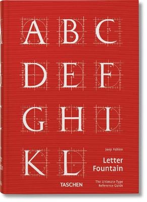
Letter Fountain
Seiten
2015
TASCHEN GmbH (Verlag)
978-3-8365-5453-4 (ISBN)
TASCHEN GmbH (Verlag)
978-3-8365-5453-4 (ISBN)
- Keine Verlagsinformationen verfügbar
- Artikel merken
A bargain price student’s edition of the award-winning typeface handbook.Featuring over 150 typefaces; a detailed examination of the form and anatomy of every letter of the alphabet; full-page tables of font scale, weight, and useful alternatives; and a manual for developing digital fonts.
Now available at a bargain student price, Letter Fountain is the ultimate typeface handbook.
In addition to examining the form and anatomy of every letter in the alphabet, punctuation marks, and special characters, the book examines over 150 typefaces, their origins and font characteristics, with full-page tables including scale, weight, and useful alternatives.
Cross-references allow these typefaces to exist in a broader visual culture context, comparing important designs with seminal artpieces and movements from Gutenberg’s era to the aesthetics of the digital age.
With special attention to finding the right typeface for a given job, the handbook also includes a manual for developing digital fonts, advice on typographic rules, an in-depth comparison between sans-serif and serif typefaces, and an essay about measuring systems and indications. The extensive appendix contains a general index, a typeface index, an index of over 250 type designers, an exhaustive index of type foundries, a graphical dictionary, and a bibliography for further reading.
This book received a Certificate for Typographic Excellence from Type Directors Club New York (TDC) in 2010, and a Red Dot Design Award from the Design Zentrum Nordrhein-Westfalen, Germany.
Joep Pohlen is a graphic designer, devoted with heart and soul to professional typography. With his colleague and friend Geert Setola he founded Dutch Fontana Publishers in 1994 and together they published their first edition of Letterfontein. From 2002 to 2010 Joep Pohlen rewrote most of the contents and enhanced the book to 640 pages. He has won several book design awards on typography and art.
| Erscheint lt. Verlag | 25.4.2015 |
|---|---|
| Verlagsort | Cologne |
| Sprache | englisch |
| Maße | 168 x 240 mm |
| Gewicht | 1362 g |
| Themenwelt | Kunst / Musik / Theater ► Design / Innenarchitektur / Mode |
| Informatik ► Grafik / Design ► Desktop Publishing / Typographie | |
| ISBN-10 | 3-8365-5453-4 / 3836554534 |
| ISBN-13 | 978-3-8365-5453-4 / 9783836554534 |
| Zustand | Neuware |
| Haben Sie eine Frage zum Produkt? |
Mehr entdecken
aus dem Bereich
aus dem Bereich


