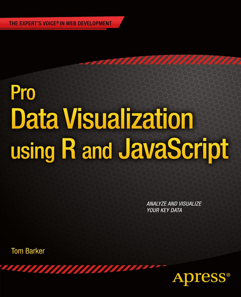
Pro Data Visualization using R and JavaScript
Seiten
2013
|
1st ed.
Apress (Verlag)
978-1-4302-5806-3 (ISBN)
Apress (Verlag)
978-1-4302-5806-3 (ISBN)
- Titel erscheint in neuer Auflage
- Artikel merken
Zu diesem Artikel existiert eine Nachauflage
Pro Data Visualization using R and JavaScript makes the R language approachable, and promotes the idea of data gathering and analysis. You'll see how to use R to interrogate and analyze your data, and then use the D3 JavaScript library to format and display that data in an elegant, informative, and interactive way. You will learn how to gather data effectively, and also how to understand the philosophy and implementation of each type of chart, so as to be able to represent the results visually.
With the popularity of the R language, the art and practice of creating data visualizations is no longer the preserve of mathematicians, statisticians, or cartographers. As technology leaders, we can gather metrics around what we do and use data visualizations to communicate that information. Pro Data Visualization using R and JavaScript combines the power of the R language with the simplicity and familiarity of JavaScript to display clear and informative data visualizations.
Gathering and analyzing empirical data is the key to truly understanding anything. We can track operational metrics to quantify the health of our products in production. We can track quality metrics of our projects, and even use our data to identify bad code. Visualizing this data allows anyone to read our analysis and easily get a deep understanding of the story the data tells.
Tom Barker is an engineer, a professor and an author. Currently he is Sr Manager of Web Development at Comcast, and an instructor at Philadelphia University. He has authored several books on web development including Pro JavaScript Performance: Monitoring and Visualization, and Pro Data Visualization with JavaScript and R.
Techniques for Data Visualization
The R Language
A Deeper Dive into R
Data Visualization with D3
Visualizing Spatial Information from Access Logs (Data Maps)
Visualizing Defects over Time (Time Series)
Bar Charts
Correlation Analysis with Team Dynamics (Scatterplot and Bubble Chart)
Balancing Delivery with Quality (Parallel Coordinates Chart)
| Zusatzinfo | 123 Illustrations, black and white; XVII, 216 p. 123 illus. |
|---|---|
| Verlagsort | Berlin |
| Sprache | englisch |
| Maße | 178 x 254 mm |
| Gewicht | 4118 g |
| Themenwelt | Mathematik / Informatik ► Informatik ► Betriebssysteme / Server |
| Mathematik / Informatik ► Informatik ► Datenbanken | |
| Mathematik / Informatik ► Informatik ► Netzwerke | |
| Mathematik / Informatik ► Informatik ► Software Entwicklung | |
| Mathematik / Informatik ► Informatik ► Web / Internet | |
| ISBN-10 | 1-4302-5806-3 / 1430258063 |
| ISBN-13 | 978-1-4302-5806-3 / 9781430258063 |
| Zustand | Neuware |
| Informationen gemäß Produktsicherheitsverordnung (GPSR) | |
| Haben Sie eine Frage zum Produkt? |
Mehr entdecken
aus dem Bereich
aus dem Bereich
der Ausbildungsbegleiter
Buch | Hardcover (2023)
Rheinwerk (Verlag)
CHF 55,85


