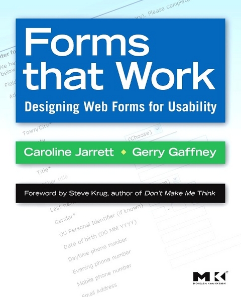
Forms that Work (eBook)
288 Seiten
Elsevier Science (Verlag)
978-0-08-094848-5 (ISBN)
Forms that Work: Designing Web Forms for Usability clearly explains exactly how to design great forms for the web. The book provides proven and practical advice that will help you avoid pitfalls, and produce forms that are aesthetically pleasing, efficient and cost-effective. It features invaluable design methods, tips, and tricks to help ensure accurate data and satisfied customers. It includes dozens of examples - from nitty-gritty details (label alignment, mandatory fields) to visual designs (creating good grids, use of color).
This book isn't just about colons and choosing the right widgets. It's about the whole process of making good forms, which has a lot more to do with making sure you're asking the right questions in a way that your users can answer than it does with whether you use a drop-down list or radio buttons. In an easy-to-read format with lots of examples, the authors present their three-layer model - relationship, conversation, appearance. You need all three for a successful form - a form that looks good, flows well, asks the right questions in the right way, and, most important of all, gets people to fill it out. Liberally illustrated with full-color examples, this book guides readers on how to define requirements, how to write questions that users will understand and want to answer, and how to deal with instructions, progress indicators and errors.
This book is essential reading for HCI professionals, web designers, software developers, user interface designers, HCI academics and students, market research professionals, and financial professionals.
*Provides proven and practical advice that will help you avoid pitfalls, and produce forms that are aesthetically pleasing, efficient and cost-effective.*Features invaluable design methods, tips, and tricks to help ensure accurate data and satisfied customers.
*Includes dozens of examples -- from nitty-gritty details (label alignment, mandatory fields) to visual designs (creating good grids, use of color).
*Foreword by Steve Krug, author of the best selling Don't Make Me Think!
Forms that Work: Designing Web Forms for Usability clearly explains exactly how to design great forms for the web. The book provides proven and practical advice that will help you avoid pitfalls, and produce forms that are aesthetically pleasing, efficient and cost-effective. It features invaluable design methods, tips, and tricks to help ensure accurate data and satisfied customers. It includes dozens of examples - from nitty-gritty details (label alignment, mandatory fields) to visual designs (creating good grids, use of color). This book isn't just about colons and choosing the right widgets. It's about the whole process of making good forms, which has a lot more to do with making sure you're asking the right questions in a way that your users can answer than it does with whether you use a drop-down list or radio buttons. In an easy-to-read format with lots of examples, the authors present their three-layer model - relationship, conversation, appearance. You need all three for a successful form - a form that looks good, flows well, asks the right questions in the right way, and, most important of all, gets people to fill it out. Liberally illustrated with full-color examples, this book guides readers on how to define requirements, how to write questions that users will understand and want to answer, and how to deal with instructions, progress indicators and errors. This book is essential reading for HCI professionals, web designers, software developers, user interface designers, HCI academics and students, market research professionals, and financial professionals. *Provides proven and practical advice that will help you avoid pitfalls, and produce forms that are aesthetically pleasing, efficient and cost-effective. *Features invaluable design methods, tips, and tricks to help ensure accurate data and satisfied customers. *Includes dozens of examples -- from nitty-gritty details (label alignment, mandatory fields) to visual designs (creating good grids, use of color).*Foreword by Steve Krug, author of the best selling Don't Make Me Think!
| Erscheint lt. Verlag | 2.3.2009 |
|---|---|
| Vorwort | Steve Krug |
| Sprache | englisch |
| Themenwelt | Mathematik / Informatik ► Informatik ► Datenbanken |
| Informatik ► Software Entwicklung ► User Interfaces (HCI) | |
| Informatik ► Web / Internet ► Web Design / Usability | |
| ISBN-10 | 0-08-094848-0 / 0080948480 |
| ISBN-13 | 978-0-08-094848-5 / 9780080948485 |
| Haben Sie eine Frage zum Produkt? |
Kopierschutz: Adobe-DRM
Adobe-DRM ist ein Kopierschutz, der das eBook vor Mißbrauch schützen soll. Dabei wird das eBook bereits beim Download auf Ihre persönliche Adobe-ID autorisiert. Lesen können Sie das eBook dann nur auf den Geräten, welche ebenfalls auf Ihre Adobe-ID registriert sind.
Details zum Adobe-DRM
Dateiformat: EPUB (Electronic Publication)
EPUB ist ein offener Standard für eBooks und eignet sich besonders zur Darstellung von Belletristik und Sachbüchern. Der Fließtext wird dynamisch an die Display- und Schriftgröße angepasst. Auch für mobile Lesegeräte ist EPUB daher gut geeignet.
Systemvoraussetzungen:
PC/Mac: Mit einem PC oder Mac können Sie dieses eBook lesen. Sie benötigen eine
eReader: Dieses eBook kann mit (fast) allen eBook-Readern gelesen werden. Mit dem amazon-Kindle ist es aber nicht kompatibel.
Smartphone/Tablet: Egal ob Apple oder Android, dieses eBook können Sie lesen. Sie benötigen eine
Geräteliste und zusätzliche Hinweise
Buying eBooks from abroad
For tax law reasons we can sell eBooks just within Germany and Switzerland. Regrettably we cannot fulfill eBook-orders from other countries.
aus dem Bereich


