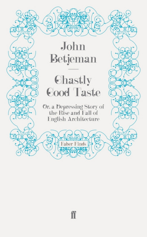
Ghastly Good Taste (eBook)
121 Seiten
Faber & Faber (Verlag)
978-0-571-28691-1 (ISBN)
Poet and architectural critic, Sir John Betjeman was born in North London in 1906. He was taught by T S Eliot at Highgate Junior School and was rusticated from Magdalen College Oxford for failing Divinity. He published several poetry collections, including New Bats in Old Belfries and A Few Late Chrysanthemums, and several works on architecture. His Collected Poems was published in 1958 and the first edition sold over 100,000 copies. He was knighted in 1969 and appointed Poet Laureate in 1972. He died in Cornwall in 1984.
'My own interest started in seeking out what was old. When the guide told me that this was the bed in which Queen Elizabeth slept, I believed him. When owners of country cottages in Suffolk told me their cottage was a thousand years old, I believed them too. I thought that this or that church was the smallest in England, and that secret passages ran under ruined monasteries, so that monks could get to the nearest convent without being seen. The older anything was the lovelier I thought it.'Most famous for his poetry, John Betjeman was also passionate about architecture, 'preferring all centuries to my own'. In his first prose work, Ghastly Good Taste (1933), he vigorously defends his love of Victorian and Edwardian architecture, considered deeply unfashionable at the time. With the savage humour of his famous satire 'Slough', he attacks notions of Modernism and (at the other extreme) unthinking antiquarianism.
I wrote this book thirty-eight years ago. I was twenty-six, in love, and about to be married. When Anthony Blond said he would like to reprint it, I thought I had better read it, and he kindly sent me a copy. I am appalled by its sententiousness, arrogance and the sweeping generalisations in which it abounds. The best things about it are the fancy cover, which I designed myself from display types found in the capacious nineteenth-century premises of Stevens, Shanks & Sons, 89 Southwark Street, type founders. In their collection they discovered for me the little railway train and the founts which in descending order are Ultra Bodoni, Argentine, Bodoni, Rustic. I have an idea that the sans-serif outline capitals in which the word ‘Illustration’ is written, is a Grotesque. The black letter for ‘Mr Fleetwood-Hesketh’ is Westminster. The text of the book is in a modern face, because most books on architecture in the early thirties were printed in a sans-serif a long way after Gill, and to print a book of this size and to use an italic running commentary at the top of each right-hand page was hopelessly old-fashioned.
Display types were generally sans-serif and title-page and cover had to be pure and empty-looking, and nothing quite in the middle, so as to show that it was up to date.
The real point of the book was the Street of Taste, or the March of English Art down the Ages, specially drawn by Peter Fleetwood-Hesketh, with traffic to match. This pull-out was also an old-fashioned thing to do, and the style of architectural caricature was deliberately based on Pugin’s caricatures in his book Contrasts (1836). This pull-out was what caused people to buy the book, and looking back at it, I regard it as far less modish and much more balanced than the text. Mr Fleetwood-Hesketh has kindly continued the depressing theme up to 1970.
I thought it might be helpful to attempt an aesthetic autobiography up to the date when this book was published. Most people who were small children when the 1914 war started and with an interest in buildings, will have had similar aesthetic experiences. I have thought it best to be extremely personal at the risk of seeming egotistic, because I can see no other way of explaining the state of mind which enabled me to dash out this book in something like a white-hot fury.
My own interest started in seeking out what was old. When the guide told me that this was the bed in which Queen Elizabeth slept, I believed him. When owners of country cottages in Suffolk told me their cottage was a thousand years old, I believed them too. I thought that this or that church was the smallest in England, and that secret passages ran under ruined monasteries, so that monks could get to the nearest convent without being seen. The older anything was the lovelier I thought it. I was quite uncritical, as are hundreds of thousands of my fellow citizens in the same happy state of childlike innocence about architecture.
The next stage of interest started at about the age of twelve. This was a preoccupation with the different styles of mediaeval parish churches. It goes with detective fiction, for it is great fun discovering a half-hidden Norman arch or a blocked-up squint or a banner-stave locker (whatever that may have been). Saxon was crude and rude and scarce, Norman was strong and bold like William the Conqueror and easy to recognise, because the arches were round. The next style, Early English, was the purest, because it was the beginning of Gothic, and things are always pure when they begin. The next style was the curvilinear and geometrical tracery and foliated capitals of Decorated, the middle style and generally regarded as the perfection of Gothic. For when things are in their middle they are perfect. After this came the debased but omnipresent Perpendicular style, which was to be found in all the churches I knew, particularly in those of Norfolk and Cornwall.
Uncritically in these days I loved every Tudor manor house and thatched cottage on a green and every timber-framed tile-hung farmhouse with brick chimney stacks. Doubtless many a church which I admired as the perfection of Gothic, that is to say, Decorated, was really Victorian, while most of the thatched and tile-hung houses and Tudor manor houses were Victorian too. I could not tell the fake from the genuine.
I think a sense of architecture in the round comes with puberty. It is then that one begins to appreciate proportion and shape and lines of construction. At my private school, Lynam’s, at Oxford, I was lucky enough to be allowed to go off with friends bicycling in the limestone villages of Oxon., and also to visit the colleges in the University itself. By the time I had reached my public school at Marlborough in Wiltshire, the absence of limestone, the comparative paucity of parish churches within bicycling distance, the bare chalk downs, beechwoods, brick cottages and thatched barns, did not have the appeal of either Oxford and the Cotswolds, or the tall flint wool churches of Norfolk, or those granite and round-roofed boat-builders’ jobs, the churches of Cornwall. Life was rougher, food was worse, and fears were greater.
Architecture was hardly mentioned at Marlborough and it was not until I was over sixteen that I became aware of it as part of the school surroundings. Then there were two influences working in contrary directions. There was that good, delightful and hospitable man Colonel Christopher Hughes, the art master. He treated us as adults and led us off on sketching expeditions to villages which were then remote, down chalky and flinty lanes rarely invaded by the motor car. Here we would sit in front of a thatched barn, a haystack or a row of summer elms and make a rough outline in pencil of what we saw, before applying the watercolour. ‘Wet the whole surface for sky, apply cobalt and ultramarine but no prussian blue, and if you want a grey cloud add light red to the ultramarine while the surface is still wet. Now apply blotting paper or a handkerchief to get the patchy effect of clouds. The sky should be a deeper blue at the top, paling as it reaches the horizon.’ When the paint dried the effect was indeed often quite remarkable. After that one painted the rest of the picture using a light yellow first where it was needed, either on its own or as a background to greens. ‘Never use artificial greens, like green bice, but make your own out of combinations of yellow and blue.’ All this industry was accompanied by talk about anything except sex. Then there was tea in a cottage with Wiltshire lardy cake. I was never much good at watercolours. John Edward Bowle, the historian, was much the best, and won the Art Cup in 1924. He could paint the downs, big elm trees heavy with shadow and thatched cottages, worthy of an R.S.W. or even an R.A. These sketching expeditions taught me to appreciate the importance of the setting of a building, the shapes of trees, and the effects of light in different weathers, and at different times of day. I still secretly thought that if anyone had invented colour photography—and they had not invented it then—there would be no need for us to do watercolours. Constable and Arnesby Brown, my father’s two favourite landscape artists, I thought had they known about colour photography, would have used the camera instead of going to all that trouble with oil paint. As for the pre-Raphaelites, obviously they would have used colour cameras.
Meanwhile there was an anti-art master and sketching movement in the school. This was headed by Ellis Waterhouse (now Professor of Fine Arts and Director of the Barber Institute, Birmingham) and Anthony Blunt (now Keeper of the Queen’s Pictures and Director of the Courtauld Institute of Art). It was through them and Anthony’s elder brother, Wilfred, that we art enthusiasts learned of the existence of the French Impressionists and particularly the painting of Cézanne, which Christopher Hughes thought little of. I do not think Ellis or Anthony ever drew or painted anything themselves, certainly they never went on Christopher Hughes’s sketching expeditions. But they told us about Clive Bell and Significant Form and Roger Fry. They were much cleverer boys than the rest of us, and early became members of the sixth and of the entourage of ‘Gussie’, that is to say Mr G. N. Sargeaunt, a remote, distinguished figure, whom it was never my privilege to know. To Christopher Hughes these original and useful Marlborough aesthetes were pretentious. He did not think that they understood about perspective and technique, and he had anyhow little sympathy with Impressionism. He was at heart a pre-Raphaelite. His father was the Hughes of Ward & Hughes, stained-glass artists, and his father had trained him. His father died, aged 100, in the late 1940s. Meanwhile Anthony Blunt bought for us reproductions of Italian primitives and Renaissance painters, which we hung in our studies. These paintings made me realise I could never be an artist myself, I would never master the technique. I began to believe that English painting was provincial and not ‘great’. The Italians and the French are the only good painters. This made Christopher Hughes defend the Dutch. We were much pleasurably torn by this aesthetic dispute. When I say ‘we’ I mean the aesthetes at Marlborough, for it was at that time a Philistine and hearty school, where games were...
| Erscheint lt. Verlag | 2.2.2012 |
|---|---|
| Verlagsort | London |
| Sprache | englisch |
| Themenwelt | Kunst / Musik / Theater ► Kunstgeschichte / Kunststile |
| Technik ► Architektur | |
| Schlagworte | Architecture • Design • Faber Finds • Heritage • modernism |
| ISBN-10 | 0-571-28691-7 / 0571286917 |
| ISBN-13 | 978-0-571-28691-1 / 9780571286911 |
| Haben Sie eine Frage zum Produkt? |
Größe: 345 KB
DRM: Digitales Wasserzeichen
Dieses eBook enthält ein digitales Wasserzeichen und ist damit für Sie personalisiert. Bei einer missbräuchlichen Weitergabe des eBooks an Dritte ist eine Rückverfolgung an die Quelle möglich.
Dateiformat: EPUB (Electronic Publication)
EPUB ist ein offener Standard für eBooks und eignet sich besonders zur Darstellung von Belletristik und Sachbüchern. Der Fließtext wird dynamisch an die Display- und Schriftgröße angepasst. Auch für mobile Lesegeräte ist EPUB daher gut geeignet.
Systemvoraussetzungen:
PC/Mac: Mit einem PC oder Mac können Sie dieses eBook lesen. Sie benötigen dafür die kostenlose Software Adobe Digital Editions.
eReader: Dieses eBook kann mit (fast) allen eBook-Readern gelesen werden. Mit dem amazon-Kindle ist es aber nicht kompatibel.
Smartphone/Tablet: Egal ob Apple oder Android, dieses eBook können Sie lesen. Sie benötigen dafür eine kostenlose App.
Geräteliste und zusätzliche Hinweise
Buying eBooks from abroad
For tax law reasons we can sell eBooks just within Germany and Switzerland. Regrettably we cannot fulfill eBook-orders from other countries.
Kopierschutz: Adobe-DRM
Adobe-DRM ist ein Kopierschutz, der das eBook vor Mißbrauch schützen soll. Dabei wird das eBook bereits beim Download auf Ihre persönliche Adobe-ID autorisiert. Lesen können Sie das eBook dann nur auf den Geräten, welche ebenfalls auf Ihre Adobe-ID registriert sind.
Details zum Adobe-DRM
Dateiformat: EPUB (Electronic Publication)
EPUB ist ein offener Standard für eBooks und eignet sich besonders zur Darstellung von Belletristik und Sachbüchern. Der Fließtext wird dynamisch an die Display- und Schriftgröße angepasst. Auch für mobile Lesegeräte ist EPUB daher gut geeignet.
Systemvoraussetzungen:
PC/Mac: Mit einem PC oder Mac können Sie dieses eBook lesen. Sie benötigen eine
eReader: Dieses eBook kann mit (fast) allen eBook-Readern gelesen werden. Mit dem amazon-Kindle ist es aber nicht kompatibel.
Smartphone/Tablet: Egal ob Apple oder Android, dieses eBook können Sie lesen. Sie benötigen eine
Geräteliste und zusätzliche Hinweise
Buying eBooks from abroad
For tax law reasons we can sell eBooks just within Germany and Switzerland. Regrettably we cannot fulfill eBook-orders from other countries.
aus dem Bereich


