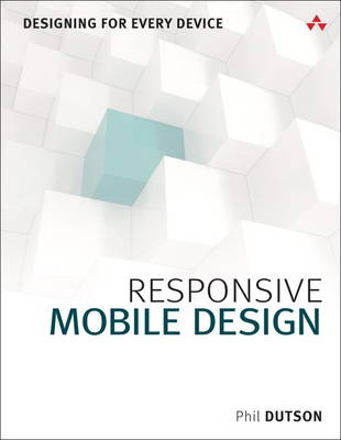
Responsive Mobile Design
Addison-Wesley Educational Publishers Inc (Verlag)
978-0-13-388821-8 (ISBN)
- Titel ist leider vergriffen;
keine Neuauflage - Artikel merken
Billions of people access the web via smartphones, tablets, and devices of all types, using every imaginable interface and display. But they all want the same thing: the right information, right now, delivered in the most aesthetically pleasing way possible. Give them what they want with Responsive Mobile Design.
Whether you’re a developer, designer, or manager, Phil Dutson teaches you principles, techniques, and best practices for delivering a successful experience to all users on all devices.
Dutson shows how to design sites that are responsive “from the start,” while keeping development simple and flexible. Next, he delivers complete technical know-how for transforming responsive designs into responsive sites. You’ll find coverage of key issues such as integrating media content, optimizing performance, and serving Retina or high-density displays.
Throughout, he combines detailed and practical explanations with functional, easy-to-reuse code snippets.
Coverage includes
• Demonstrating why “mobile first” is still a best practice
• Fusing content, structure, and beauty to deliver experiences users love
• Using responsive images to improve speed and convey visual messages more effectively
• Using grid systems without making it feel like your design is “locked in a box”
• Mastering measurement values such as px, em, rem, and viewport units—and understanding their crucial differences
• Improving the finer details of your design with web fonts
• Retrofitting current websites to prepare them for the future
• Introducing web components into your HTML markup
• Using built-in browser development tools to streamline debugging and “in-browser” prototyping
Phil Dutson is a Solution Architect over client-side and mobile implementation for ICON Health & Fitness. He is the author of Sams Teach Yourself jQuery Mobile in 24 Hours; jQuery, jQuery UI, and jQuery Mobile Recipes and Examples; and The Android Developer’s Cookbook, 2nd Edition. He enjoys learning and writing about technology, and spreading enlightenment to the world one portal at a time with his sons playing Ingress.
Preface xv
PART I: CREATING A RESPONSIVE LAYOUT 1
Chapter 1 Content Matters 3
What Makes Up Content 4
Choosing the Right Content 8
Discussing Content Sliders 13
Summary 14
Chapter 2 Why Mobile First 15
Viewing the Web 16
Considerations When Starting Small 19
Summary 26
Chapter 3 Working with Grids 27
Choosing a Grid 28
Using a Responsive Grid 31
Using an Adaptive Grid 34
Best of Both Worlds 37
Summary 37
Chapter 4 Displaying Tabular Data 39
Defining Tabular Data 40
Working with Tabular Data 41
Summary 54
Chapter 5 Working with Measurement Values 55
Using Pixels 56
Using Percentages 57
Using Em and Rem Units 61
Viewport Measurements 63
Summary 67
Chapter 6 Using Media Queries 69
The Viewport Meta Tag 70
Implementing Breakpoints 72
Device-Specific Media Queries 78
Summary 82
Chapter 7 Typography 83
Web Fonts 84
Font Formats 84
Browser and Device Support 86
Using Font Services 91
Icon Fonts 93
Summary 94
Chapter 8 Retrofitting an Existing Site 95
Choosing a Proper Layout for Mobile 96
Working with Components 101
Considerations When Going Mobile 106
Summary 109
PART II: WORKING WITH RESPONSIVE MEDIA 111
Chapter 9 Responsive Images 113
Images Should Be Responsive 114
Using a JavaScript Solution 124
Summary 127
Chapter 10 Responsive Video 129
Using Video 130
Delivery Systems 130
Making Videos Fit Mobile Devices 134
Summary 140
Chapter 11 Image Compression 141
Image Types 142
Compression Utilities 148
Compression Results 152
Summary 153
PART III: ENHANCING PERFORMANCE 155
Chapter 12 Conditional JavaScript 157
Why Conditional JavaScript 158
Using Conditional JavaScript 162
Using JavaScript Plugins 167
Summary 169
Chapter 13 Web Components 171
Working with Web Components 172
Examples of Web Components 172
Working with the DOM 176
Web Component Polyfills 180
Summary 183
Chapter 14 Device Detection and Server Requests 185
Device Detection 186
HTTP Headers 191
Using Client Hints 194
Summary 196
Chapter 15 Server Optimization 197
Server Setup 198
Web Servers 198
Server Plugins 201
Summary 209
Chapter 16 High Performance with Development Tools 211
Development Tools 212
Browser Developer Tools 212
Build Tools 225
Summary 228
Index 229
| Erscheint lt. Verlag | 2.10.2014 |
|---|---|
| Verlagsort | New Jersey |
| Sprache | englisch |
| Maße | 181 x 229 mm |
| Gewicht | 490 g |
| Themenwelt | Informatik ► Software Entwicklung ► Mobile- / App-Entwicklung |
| Informatik ► Web / Internet ► Web Design / Usability | |
| Informatik ► Weitere Themen ► Smartphones / Tablets | |
| Technik ► Nachrichtentechnik | |
| ISBN-10 | 0-13-388821-5 / 0133888215 |
| ISBN-13 | 978-0-13-388821-8 / 9780133888218 |
| Zustand | Neuware |
| Haben Sie eine Frage zum Produkt? |
aus dem Bereich


