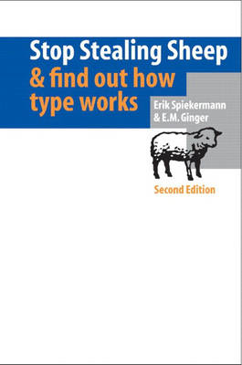
Stop Stealing Sheep & Find Out How Type Works
Adobe Press,U.S. (Verlag)
978-0-201-70339-9 (ISBN)
- Titel erscheint in neuer Auflage
- Artikel merken
This classic typography book, first published in 1993, is now updated with brand-new typefaces, fonts, and illustrations. Internationally renowned graphic designer Erik Spiekermann explains in everyday terms what typography is and offers design guidance in choosing type for legibility, meaning, and aesthetic appeal. Stop Stealing Sheep and Find Out How Type Works, 2nd Edition guides the reader through all aspects of typography, from the history and mechanics of type, to training the eye to recognize and choose typefaces. Uncover type's roots and placement within society and learn how to use space and layout to improve overall communication. This elegant guide for readers of all levels is revised and updated to discuss the particular design challenges of type on the Internet. Note: This title was originally announced in the October 2000 Pearson Technology Group catalog.
Erik Spiekermann is an internationally renowned graphic designer and the founder of MetaDesign. He wrote the bestselling first edition of this book and many articles on type and typography, as well as Rhyme and Reason: A Typographic Novel. He is also the designer of typefaces such as FF Meta and ITC Officina. He lives and works in Berlin. E.M. Ginger is a typographic consultant, editor, and freelance writer in the San Francisco Bay Area. She has worked with type and typography for two decades. She was managing editor of the journal Fine Print for twelve years and the editor of several bestselling cookbooks.
1. Type Is Everywhere.
Type exists. It is a fundamental part of our lives. These simple facts are essential to understanding how to communicate more effectively.
2. What Is Type?
Between type's past and its future, our present understanding of type is rooted in who we are and how we communicate. Type is a living entity integrated into society's moods and trends.
3. Looking at Type.
Training the eye to recognize type begins with familiar elements on the page. Looking at both a typeface's basic shape and its finest details is the first step toward understanding how type works.
4. Type with a Purpose.
Choosing typefaces for a particular purpose need not be more intimidating than planning your wardrobe. Matching an appropriate typeface with the right task is easy.
5. Type Builds Character.
Understanding the tone, or feeling, of text is essential in determining what typeface to use, and how it might be arranged on the page.
6. Types of Type.
Basic characteristics of typefaces, once understood, can eliminate difficulty with typeface identification. Simple distinctions among typefaces are best understood by analogy to human counterparts.
7. How It Works.
Legible, readable type depends on a few basic principles: space between individual letters and around words. Choosing the right typeface for the right text also means using the right spacing.
8. Putting It to Work.
Considering where type is going to live and work will determine its effectiveness. Simple rules of placement create practical page layouts.
9. There Is No Bad Type.
Type is a basic element of communication. As the means of communicating changes, type evolves in unique and lively ways.
10. Final Form.
Bibliography, list of typefaces, index.
| Erscheint lt. Verlag | 25.7.2002 |
|---|---|
| Verlagsort | Indianapolis |
| Sprache | englisch |
| Maße | 148 x 214 mm |
| Gewicht | 370 g |
| Themenwelt | Kunst / Musik / Theater ► Design / Innenarchitektur / Mode |
| Informatik ► Grafik / Design ► Desktop Publishing / Typographie | |
| Mathematik / Informatik ► Informatik ► Web / Internet | |
| ISBN-10 | 0-201-70339-4 / 0201703394 |
| ISBN-13 | 978-0-201-70339-9 / 9780201703399 |
| Zustand | Neuware |
| Haben Sie eine Frage zum Produkt? |
aus dem Bereich


